Overview
Data analytics is the process of collecting, cleaning, and analysing raw data to understand underlying trends — making informed decisions based on evidence rather than intuition. This self-study project explored inventory management and workforce analytics using Google Sheets and Power BI.
ABC Inventory Analysis
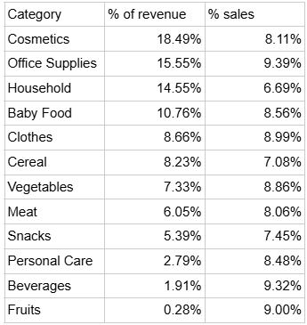
From raw retail data, two key metrics were extracted: percentage of revenue generated and percentage of sales by category (cosmetics, household items, clothing). This enabled ABC classification.
A-Items (top 20%, generating ~70-80% of value): Cosmetics and Household. These require strict control, accurate records, and frequent review. Strategy: smaller, more frequent purchases to avoid capital lock-up.
B-Items (middle 30%, ~15-25% of value): Office Supplies, Baby Food, Cereal. Moderate control and monthly reviews.
C-Items (bottom 50%, ~5% of value): Fruits, Beverages. Simple low-effort control — restock as needed. The goal: reduce holding costs, optimise warehouse space, and focus attention on top-performing categories.
Power BI Dashboard
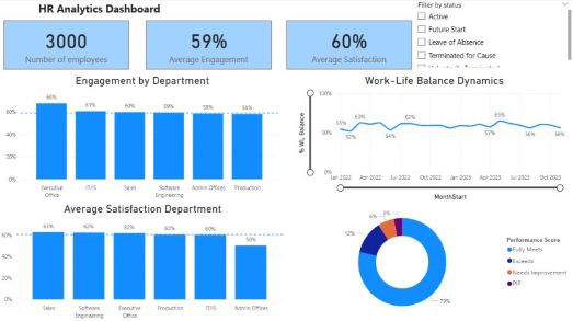
Dashboards transform data into decisions. The dashboard above visualises extrapolated data from a company of 3,000 employees — survey results covering engagement, satisfaction, work-life balance, and management performance reviews.
By surfacing which departments fall below average on key metrics, management can target interventions to more effectively raise morale in the departments that need it most.